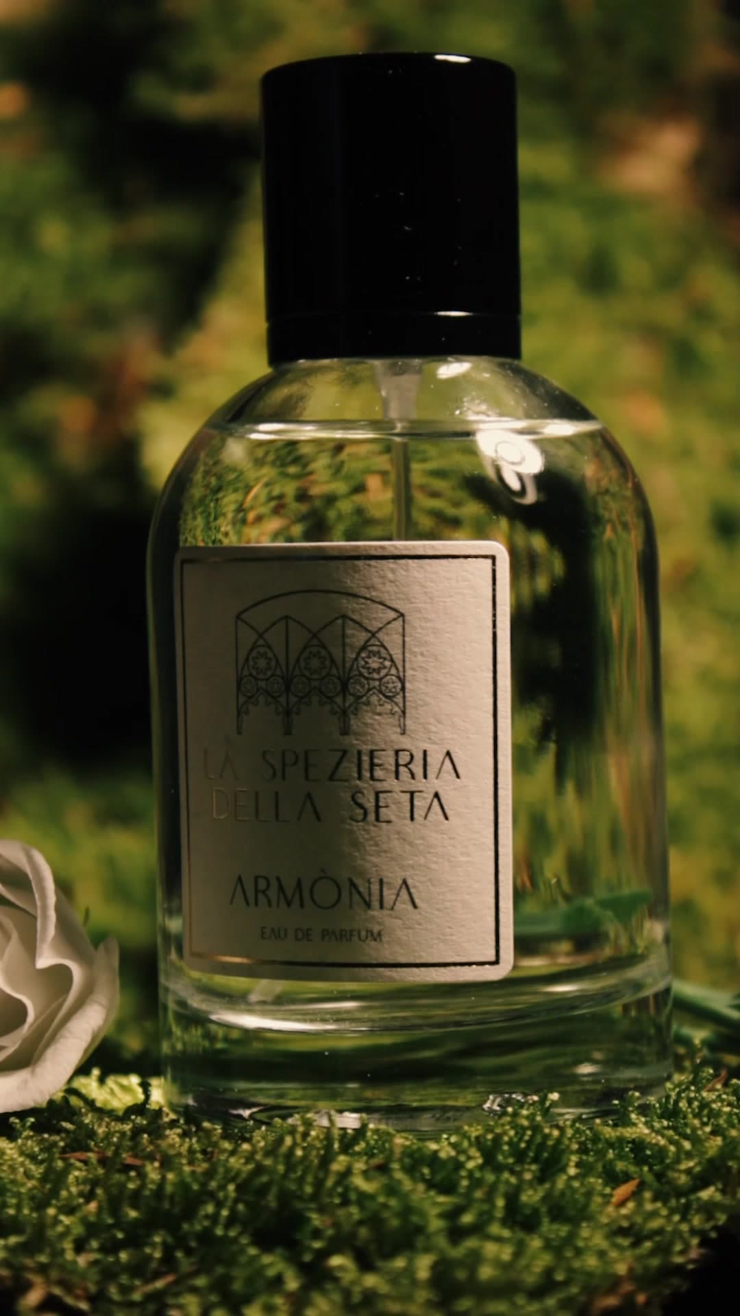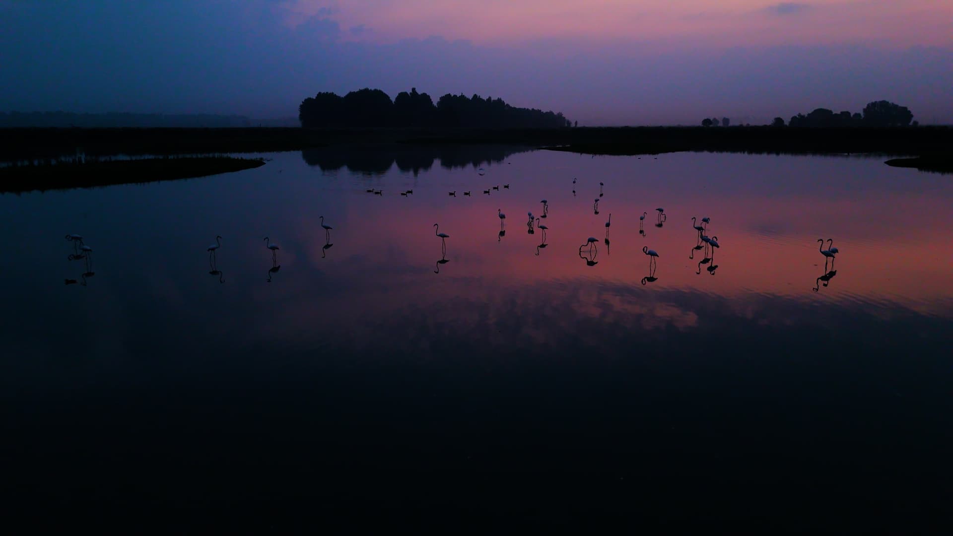
Reel: different clients, same eye
2020–2026Various clients · Visual identity · Motion and content
BeRave
A streetwear store that wasn't meant to look like just any streetwear store.
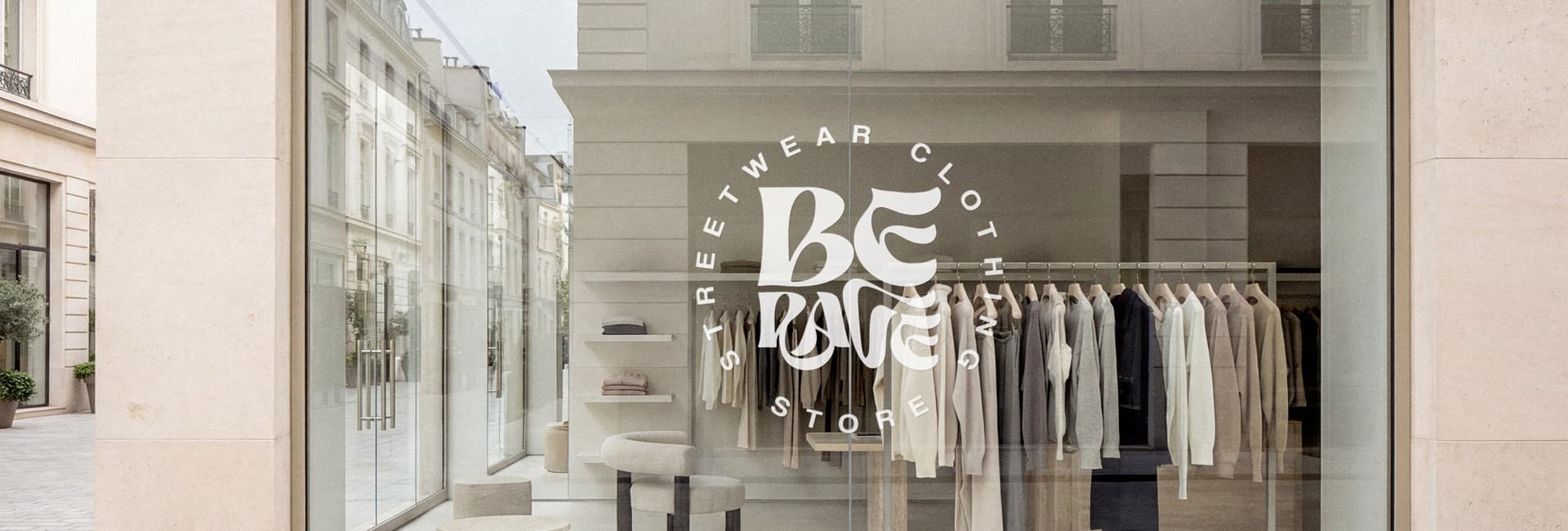
A name that immediately evokes the rave scene and the most aggressive streetwear imagery — graffiti, raw, shouted. I had to build a logo capable of carrying that name without being trapped by it.
The risk was cliché: bold, black, angular, indistinguishable from a thousand other streetwear brands. What was needed was a mark that also reflected the person behind the shop, not just the scene the name seemed to evoke.
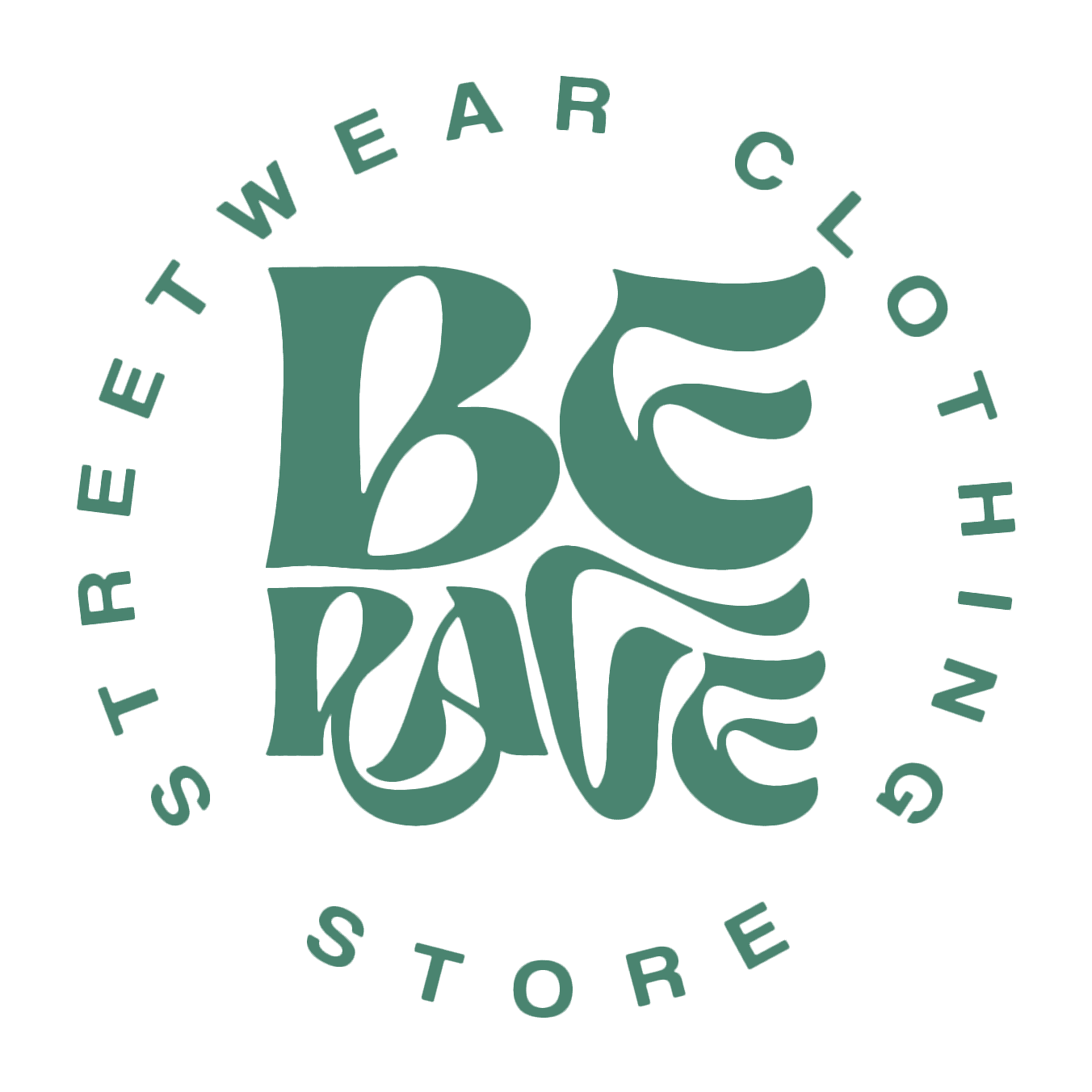
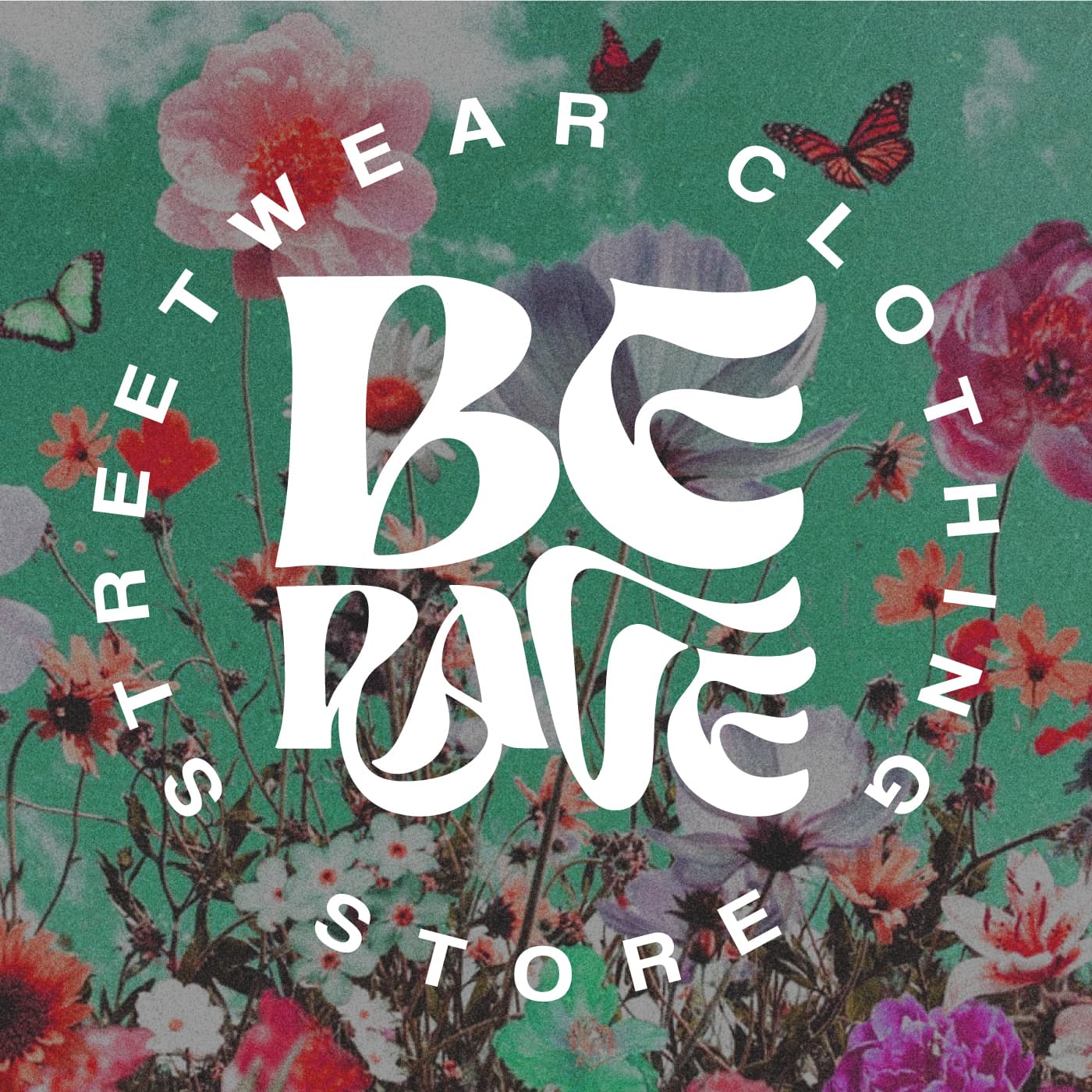
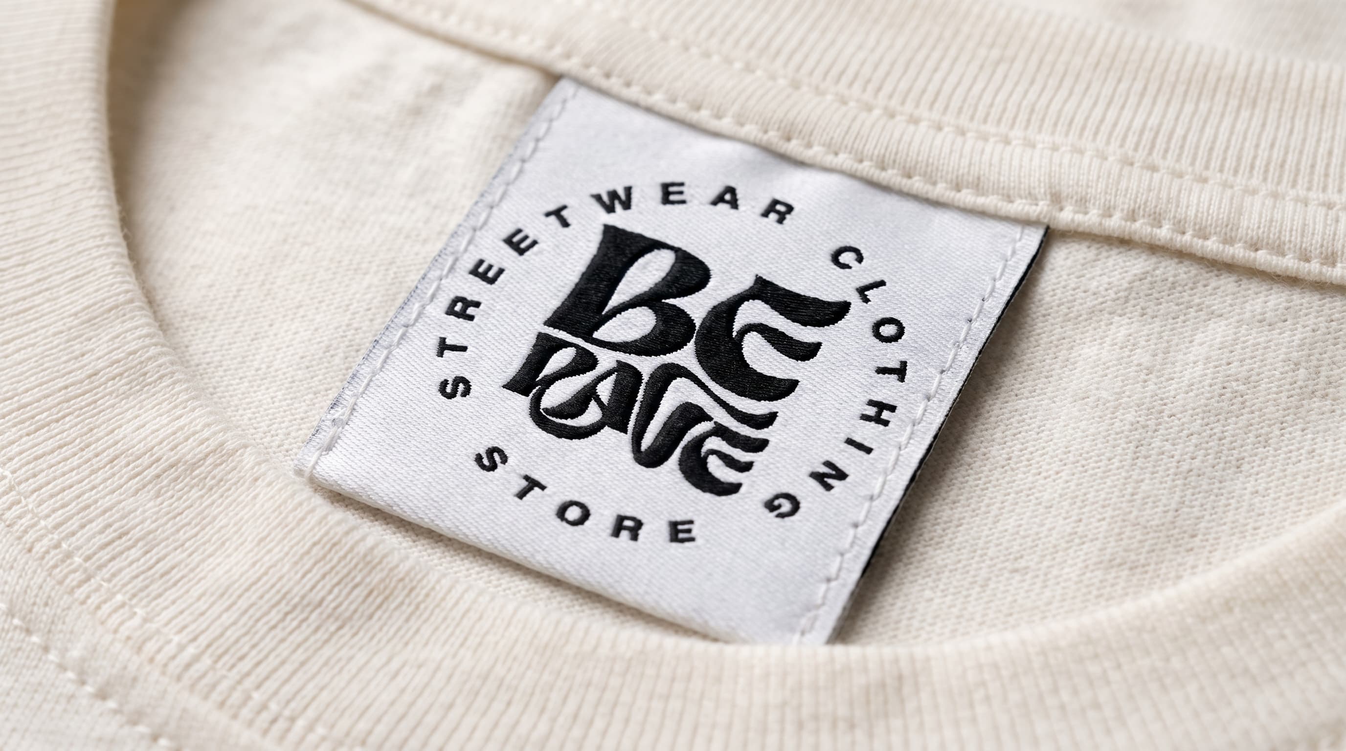
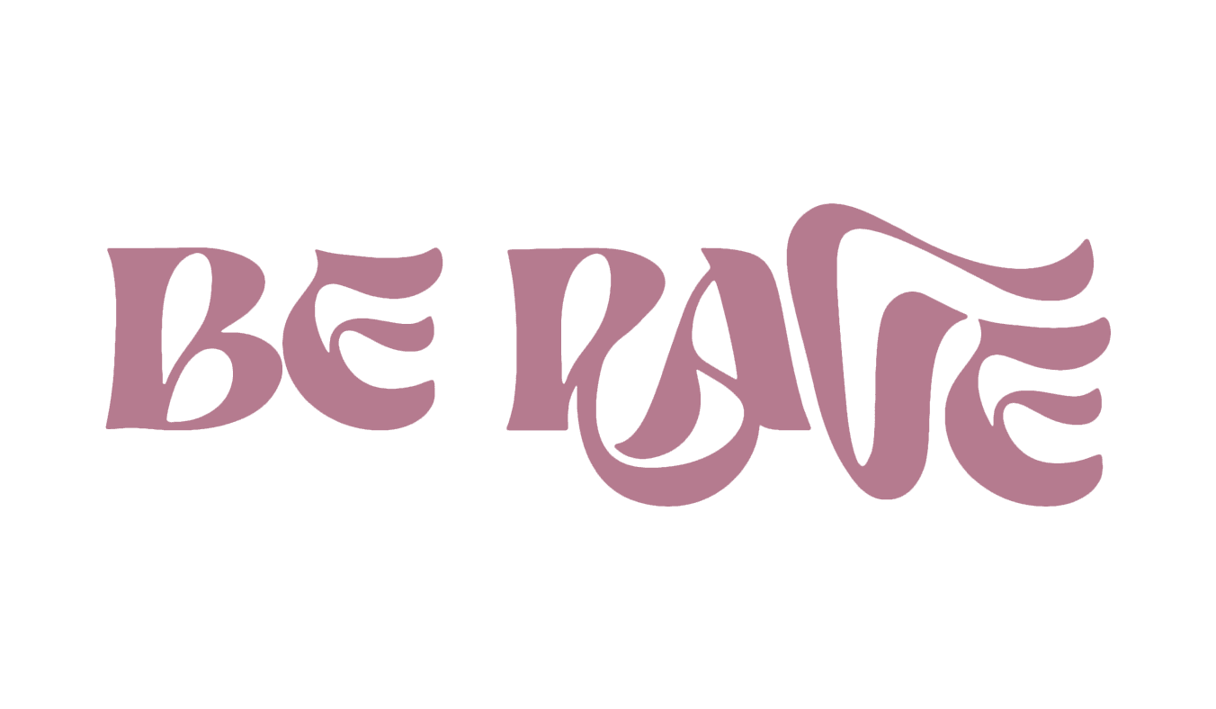
I designed hand-drawn lettering, curved and organic rather than angular: letters that intertwine and round off instead of cutting sharp. The circular badge with the shop's name recalls classic streetwear logos, but the character inside stays soft.
I avoided any direct reference to the underground world and to graffiti, to leave room for a more personal tone — less aggressive, closer to the person who actually created the shop than to the scene the name evokes.