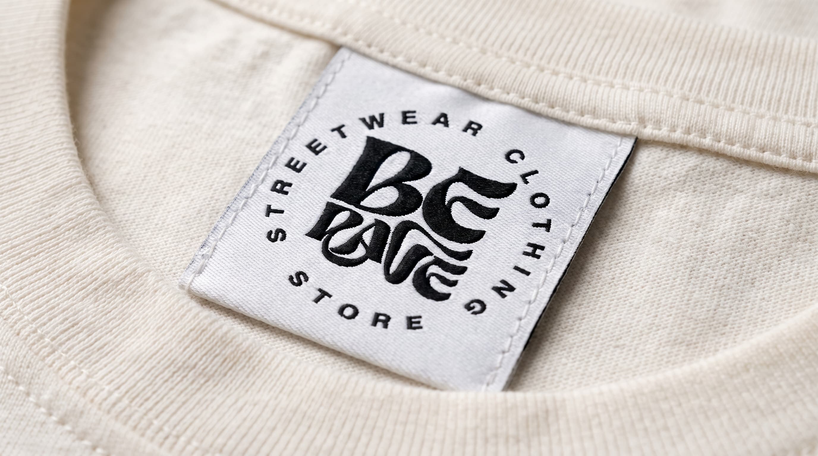
BeRave, the name shouts, the mark whispers
2023BeRave · Visual identity
ProveThemWrong
An identity that doesn't need to convince anyone: it just needs to stay standing, strong, on stage.
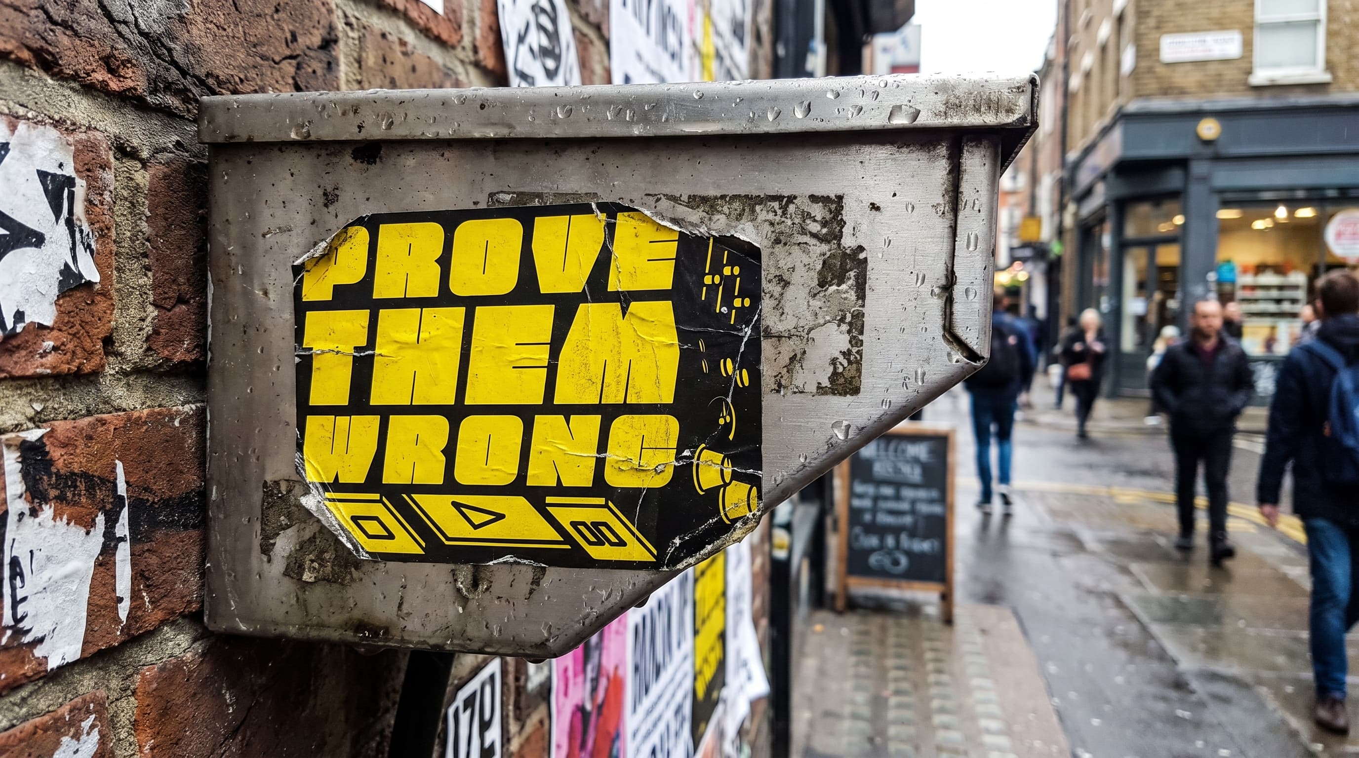
ProveThemWrong organizes hip hop concerts and events, bringing emerging artists to the stage.
Before this project, the communication traveled event by event: different flyers, different fonts, no mark able to say "this is a Prove Them Wrong event" at a glance, in a feed where every promoter uses the same clichés — graffiti fonts, worn-out textures, the word "underground" repeated everywhere.
The problem wasn't finding a name: the collective already had one, and it was already a manifesto. The problem was building a mark strong enough to carry that statement — one that worked identically on an Instagram story, on a ledwall behind the stage, and on a patch sewn onto a jacket, without ever looking like an "honest but anonymous" logo like so many others in the scene.
I treated the logo like a piece of hardware, not like lettering. Every line is a solid block, cut cleanly and tilted as if it had been sheared off a single slab; black and yellow work at maximum contrast, the same combination used on surfaces that signal "watch out, something's happening here" — consistent with a name that's already an open challenge.
In their place: a single alphabet, a tight grid, and one rule — every package states altitude, variety, roast, and date, in the same order, always. The rest is white space.
The letters aren't flat: they're extruded, with a side face that gives them volume, as if the logo were the casing of a mixer or an amplifier.
This keeps it legible even reduced to a stamp, and lets it survive the jump to difficult surfaces — patches, stickers, the back of a t-shirt — where a thin logo would disappear.
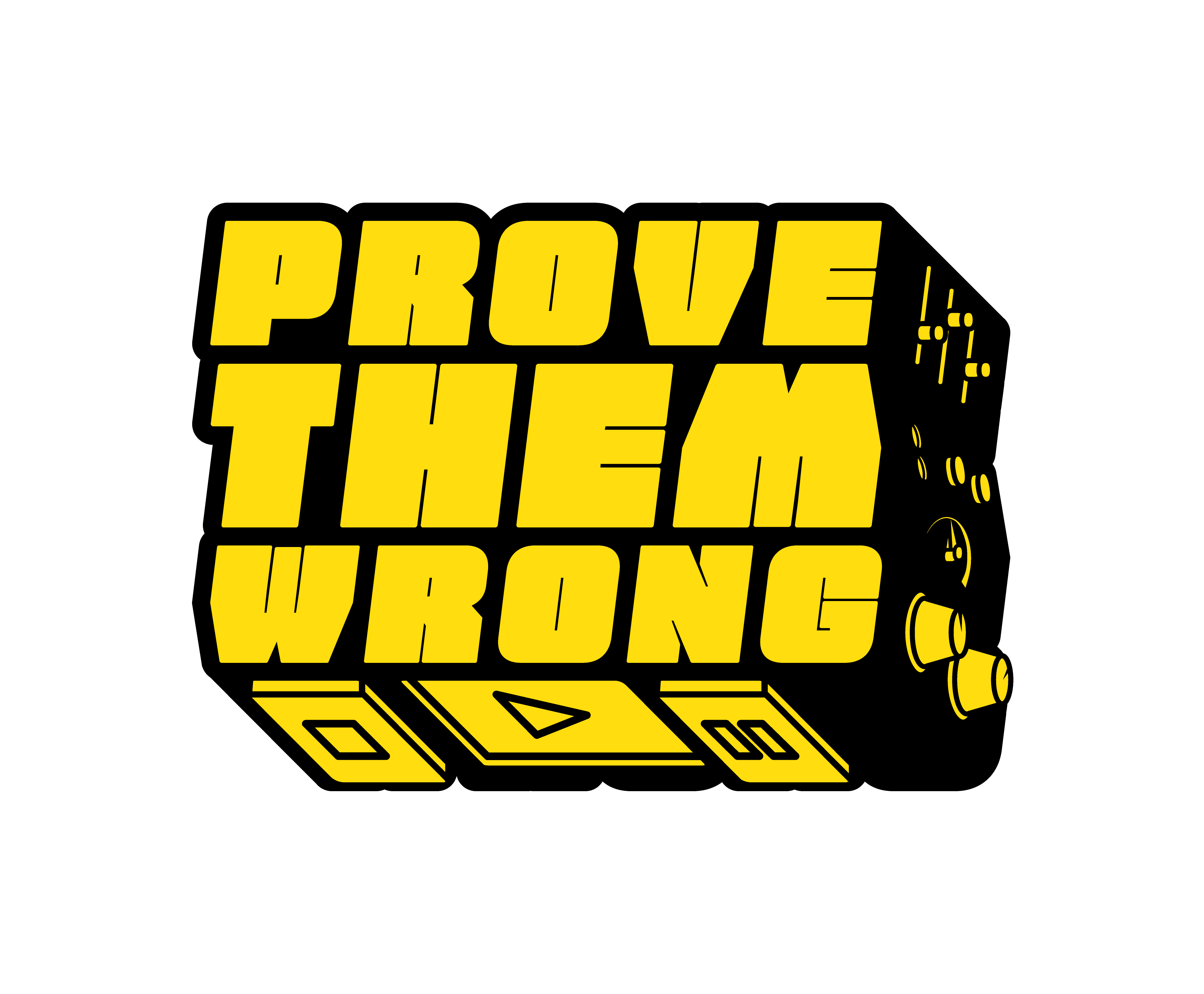
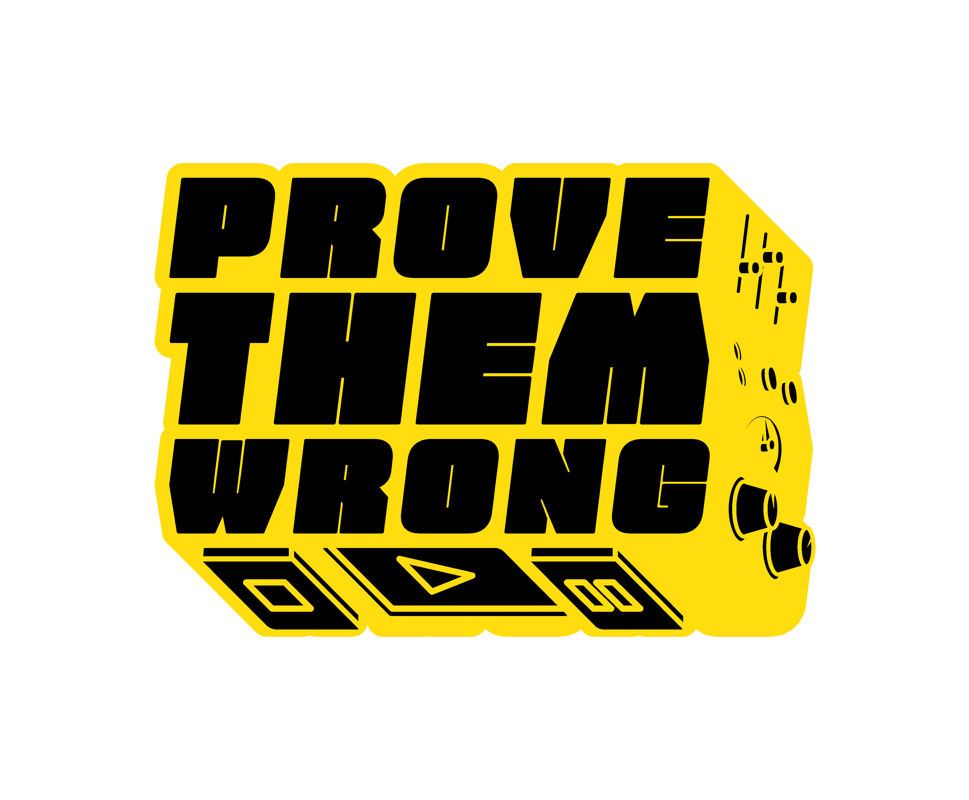
On the side of the block I drew a miniature console: knobs, a VU meter, tape reels, a play button. Anyone steeped in hip hop culture recognizes it instantly — mixers, cassettes, analog culture — while anyone looking from outside still sees a clean, powerful logo.
It's a detail that doesn't need explaining to those already inside the scene, and the three symbols at the bottom (circle, arrow, double reel) also work on their own as a standalone icon, for social media and favicons, when the full wordmark doesn't fit.